
During the recent Sagrantino Cup event I created daily trajectory forecasts with the windy.com traj plugin for the morning flights and asked pilots to share actual GPS tracks so I could compare actual versus forecast. Here is one example:
The KML file for this screenshot is available here, and it is instructive to play with it – have a look at it yourself in Google Earth.
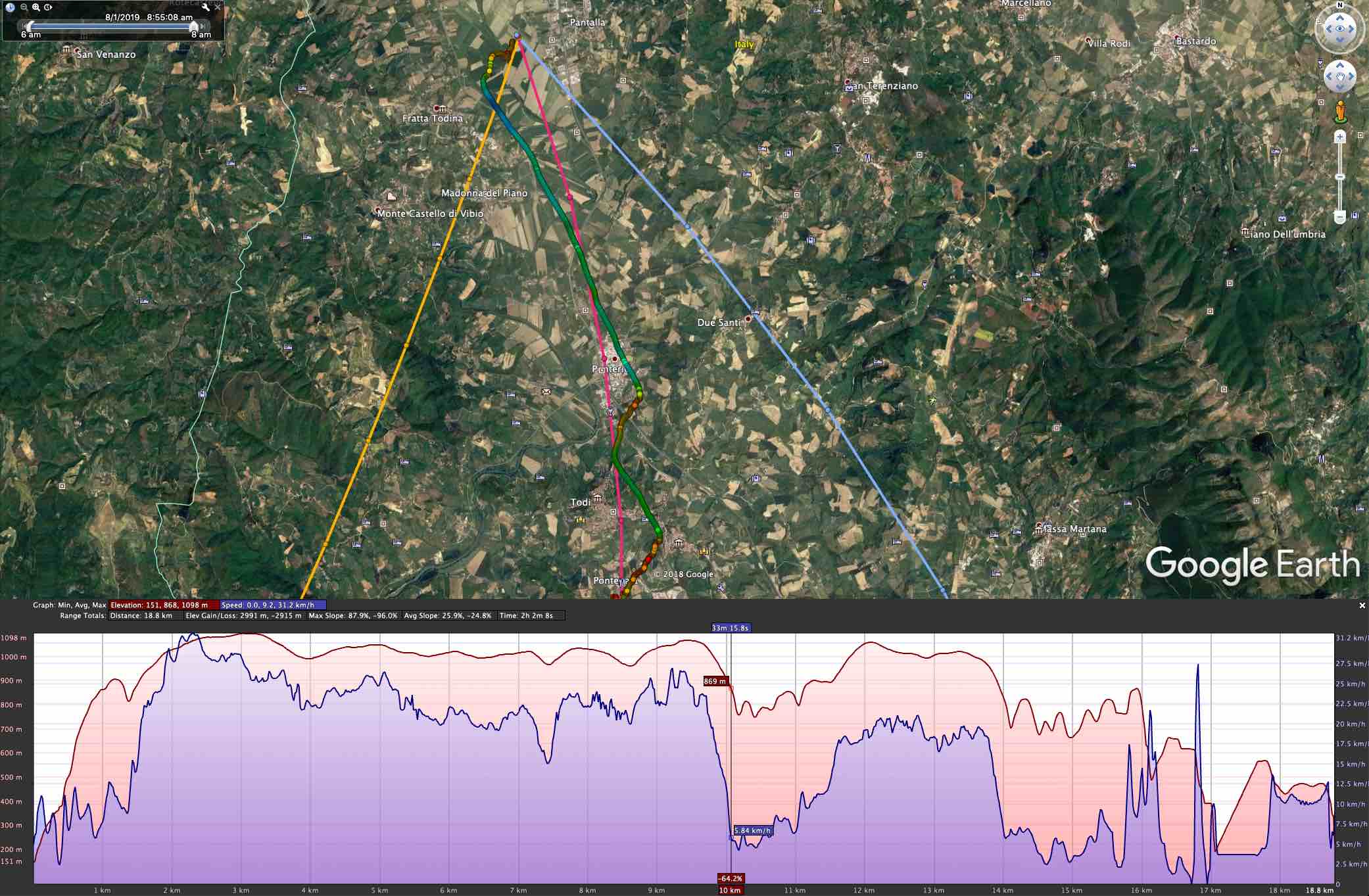
- Most of the flight was between 800m and 1000m altitude, so I selected the 2000ft (amber), 2500ft (red) and 3000ft (blue) trajectories.
- The ECMWF model had the best match, so only ECMWF forecasts are shown.
- The flight started on the valley floor, within an inversion and a slight northerly flow.
- The match is excellent – especially with the 2500ft trajectory, and the descent phases around 11km and 15km into the flight show the northeasterly flow forecast by the amber line.
- As to be expected, the track is shorter than the forecast – slightly more than half the distance.
- my gut feeling after comparing several forecasts to tracks: ECMWF wind speed forecasts are a tad on the high side.
Here is a second example:

- trajectory colors: red: 2500ft, blue: 3000ft, purple: 5000ft
- most of the flight was 1000-1200m altitude
- the track’s match with the 3000ft trajectories (all models) again is very good!